

Improve the conversion rate of the Auto Enrolment Pension campaign for Empowered Money
Case Study
May 2025
My role: UX/UI Designer Researcher
Mentor: Alessia Rossini - Grid Finance

Project Overview
This case study was completed as part of the UX Tree mentorship programme. I had to identify and validate a UX problem and design a suitable solution for the given target audience.
I chose to work with a Finance company and focus on a campaign for Auto Enrolment through a website page.
Goal
To improve the conversion rate of the Auto Enrolment Pension campaign.
Get more consultation bookings through the dedicated Auto Enrolment page on the website.
Problem >2024
October 2024
A 5 week Google ads campaign resulted in
1x call, 2 x bookings.
Challenges
New to Market
Originated Jan 2024, not as well established as their competitors.
Goals
User goal
Help the user find a more tax-efficient solution to Auto-enrolment.
Target Audience
All the below without an existing pension scheme in place.
> SME’s 0-50 Company
> CFO’s of the SME’s
> CPO’s of the SME’s
> HR People
Design process
I’ll be using the double diamond framework.
Who are Empowered Money?
Empowered Money are a relatively new finance company, offering pensions and are specifically targeting businesses to sign up to a more tax efficient alternative to the government Auto Enrolment scheme.
Owned by Shane O’Toole an independent financial advisor.

Trust
A key factor when making financial decisions. Due to being new on the scene.
Business goal
Attract and Increase more bookings to talk about and sell Pension schemes to SME’s.
Point of Note
There are many facets to consider within this project - however for this specific UX project I choose to focus on the layout alone and what impact this is causing on users decision to make a call to Empowered Money.
Discover
User testing
User interviews
Data analysis
Develop
Useability testing
Wireframing
Hi-fidelity prototyping
Define
User persona
Prioritisation Matrix
Empathy mapping
Pain point plotting
Deliver
Iteration
High-fidelity prototyping
Key Learnings
What is Auto Enrolment?
Auto-enrolment is a new retirement savings scheme which people will automatically be enrolled in once they meet certain requirements.*
01.01.2026 Enrolment deadline
*Source: gov.ie
STAGE 1
Discover
Research
I used the following methodologies to gather data:
Quantitative: Analyse the site data
Observational: User Testing
Stakeholder info: Sales Analytics
Qualitative data
Here I discovered that there was an almost equal use of mobile and desktop.
I got more information from
Usability Testing
5 users
x1: Ex HR
x2: Financial roles in small SME’s
x2: Company small owners
3 key areas presenting pain points
Booking a call
More information
Page layout
Discovered through user interviews and tests.
Stakeholder Sales Analytics
the following information was gathered from the stakeholder.
The most relevant piece mentioned here was the Finance part, it helped me spot a pattern from my user testing.
STAGE 1
Discover
Summary
Quantitative

Desktop v Mobile
Time spent on the page
Where people drop off


50%
45%
5%
Mix Platforms
Users predominantly on desktop and mobile.
1.Booking a call
2/5
testers wanted to book a call

3. Page Layout
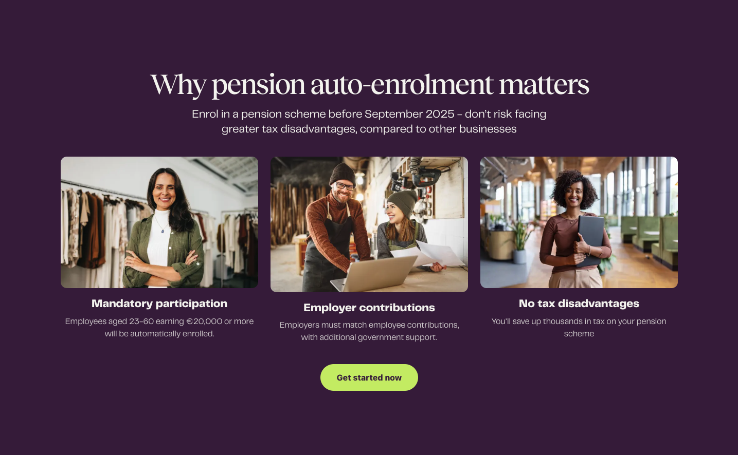
Header message
Initial messaging at the top of the page is misleading.

Observe thoughts and feelings
Identify User pain points
Oct ‘24
Ad Campaign
€4k >
Spent
Google ADs
2. More information
Users looking for more information to build further trust before making a call.
i.e Downloadable Guide
Images
feel a bit cold and stock like.
Layout
Information if not lacking is placed in the wrong areas.

Current conversion of bookings > sales
Any pain points
2/3
Booked consultation converted to a sale

“A ‘How to prepare your business guide would be useful’”
“Not ready to talk until I understand a bit more.”
““The ‘Regulatory’ language is misleading”
““The Get started
line is not clear-
What am I starting?””
Bookings
12
Sales made based out of 2/3 bookings made via google ads.
Finance
Users with finance backgrounds were the ones confident in calling.
The key discoveries from this stage were that:
Some felt that the messaging on the page was a bit unclear.
Not all users wanted to book a call.
Finance people ‘understood’ more and were more confident to book.
Testing across Mobile and Desktop brought up similar results / pain points.
Observational
Cost per Customer
40k > 4k Google Ad
Profit made so far through the larger campaign. This project focuses on layout and information.
3.3k
Cost per customer conversion
so far.
Stakeholder info
STAGE 2
Define
I used the following methodologies to gather data as I felt them the most appropriate to me project.
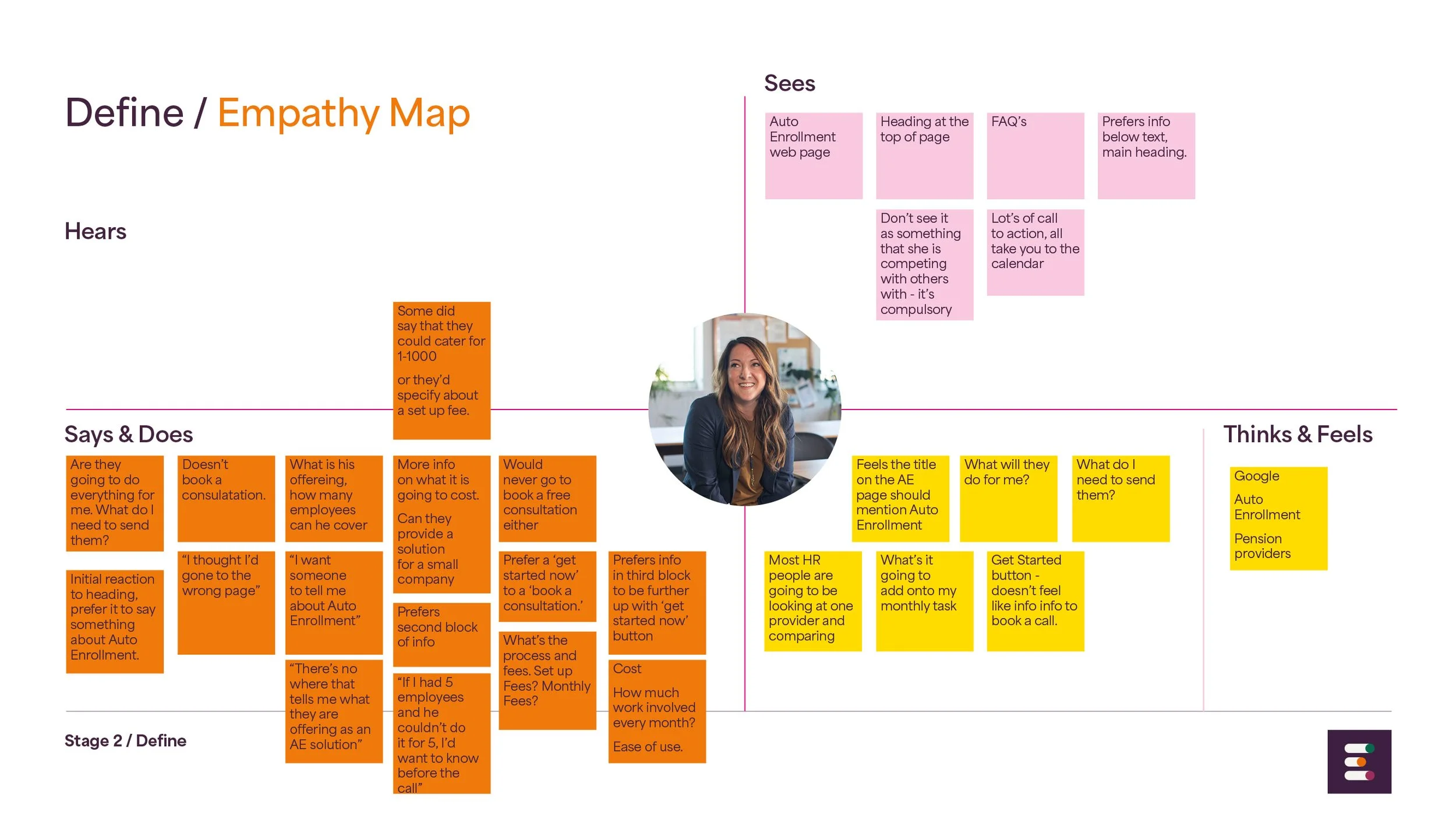
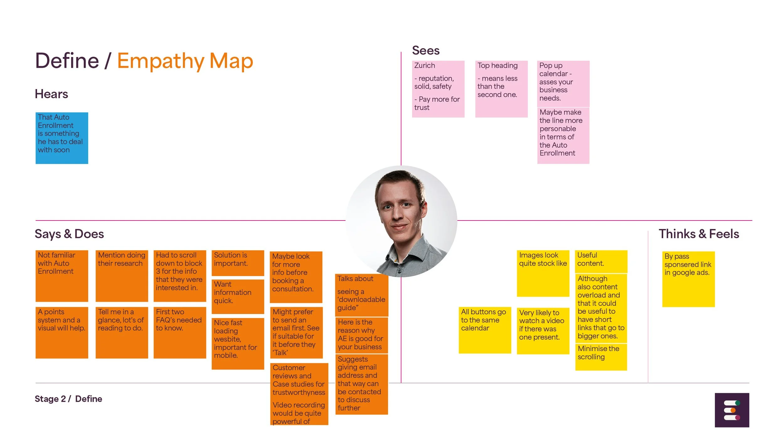
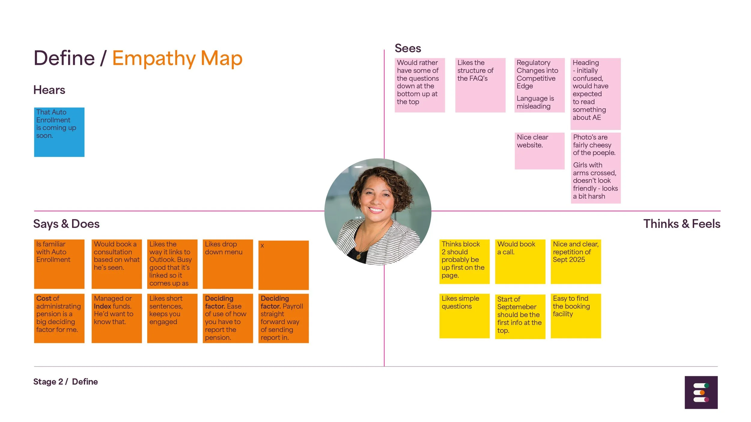
Empathy Mapping
The Empathy map helped me segment the thoughts and feelings of the users.
Summary Personas
The empathy mapping helped me gather a better idea of the Personas that were forming.
They could be split into 3 groups, all with a variety of different needs.
The HR consultant researching on behalf of their company.
The small company owner, wanting to find out more about Auto-Enrolment.
The Finance expert, confident with what they know and requiring other information.
Challenges
Prioritisation Matrix
8 Popular pain points were plotted and placed in order of high value and low effort. Taken from the Empathy mapping.
STAGE 2
Define Challenges

Persona #1
What matters most
to Emma and why?
Busy and doesn’t want to waste time talking to Empowered Money if they’ve not provided the information on the site and can’t meet their requirements.
HR Consultant
Working for SME
Wouldn’t book a call
Looking for more details has
to present higher level
Looking for details to be presented efficiently

Persona #2
What matters most
to Paul and why?
Trust is a big part of what matters, Good reviews. Clear website and information.
New Business Owner of SME
Would want more info to book a call
Looking for more information to gain trust, reviews, case studies.
Looking for another first touch point like email first
How do we educate these users (Persona#1 & #2) swiftly to give them more confidence to book a call as Persona #3 would.
Users who are not financially educated find it difficult to find the basic information that they are after.
They are looking for reviews and case studies to back up their feelings of trust.
They don’t always necessarily feel that a call would be their first point of contact with the company. They would prefer to email first.

Persona #3
What matters most
to Aisling and why?
Cost of administrating and ease of use and how you’ve to report the pension.
New Business Owner of SME
Confident to book a call
Likes the layout, feels presentation is clear
Looking for more specific details to help implement the pension.
Business / sales have come from those with a financial background.

How might we?
Educate non-financial users simply about Auto Enrolment and how it affects them?
Present the information architecture so that these users are informed quicker?
Provide solutions whereby they can learn more at their own pace to give them the confidence to book a call?
Provide reviews and real life examples for them to view?
STAGE 3
Develop
Reorder layout / reframing
I took the existing layout and considered what could be used, changed and moved around - in conjunction with the 8 pain points.
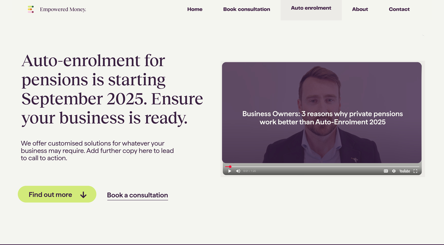
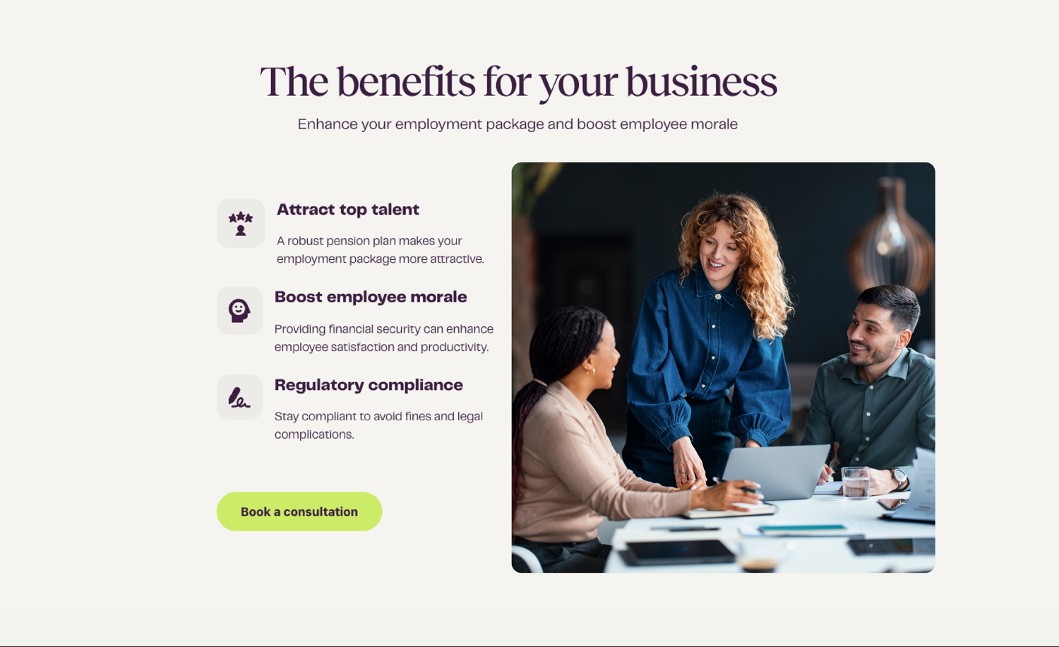
Hi-fidelity mock up
After some sketching, I settled on a first draft design and put this together in Figma. The file can be viewed at the link supplied below.
Note however that it looks different to the info presented on the right as user testing changes have been made.
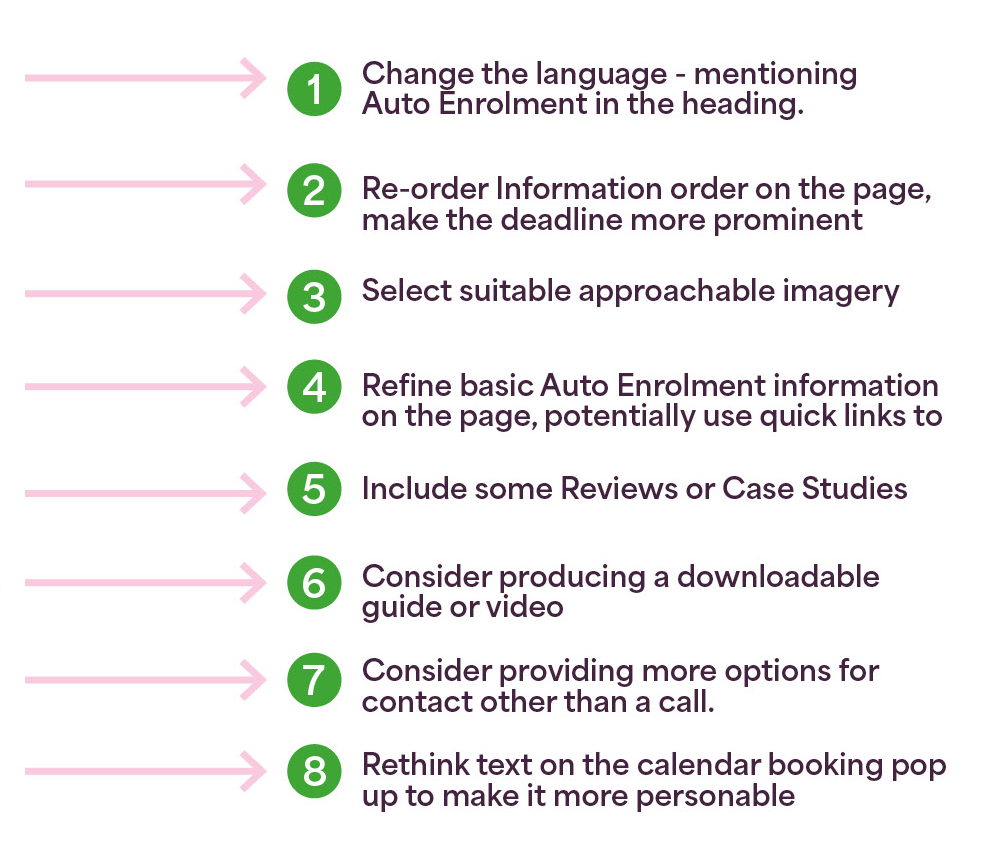
Design changes actioned at this stage
To the right is a list of the changes I identified through the user testing and subsequently made. There is a visual that also point these out in more detail.


STAGE 4
Deliver
User testing results
Tests were carried out with 4 further users, using the high fidelity mock up and changes were made as more pain points were discovered. Some are outlined here.
STAGE 4
Deliver >
Conclusion

*The deadline for Auto Enrolment has since been moved out by the government.
One of the users said that they were likely to engage with the team which was a small win.
The others were still looking for more information and clarity.
I feel further testing and fine tuning could be done, some feedback will still be worth considering and implementing, such as:
Doesn’t feel like an Irish company
A testimonial on camera
messaging: What’s it going to cost me? Tell me in a nutshell
I will engage a copywriter to help me fine tune certain messages.
Word Pension missing
This was updated immediately and makes a lot of practical sense.
2. CTA to be swapped
Two users pointed out that they’d expect the CTA to book a call to stand out more. However they understood the importance of having an option for those that were not ready to call and wanted to find out more.
3. Video title
The video title does not make sense.
“Could it be catchier and easier for the user to want to view?
(user feedback)
4. Messaging
Not quite an iteration as such - some users mentioned how this area was informative but also asked what the benefits would be to using Empowered Money.
Even though some messaging has been changed, further work can be done in adding key messages about why Empowered Money are the people to choose.
Next steps
I will make further changes to the design and sit with the client and have them implemented. Only then can I really identify the final results of my work which kind of fall out of the period of handing this case study in.
Reflections
Key Learnings
Messaging: There is more work to be done on getting simple facts out to different people. Some persona’s needs are different to others and fine tuning this message so that it is simple and easy to digest is not an easy task.
Layout: As a result of user testing further iterations need to be considered for the layout of the page.
Accessibility: I would make this a larger consideration of the whole project and plan to do so going forward.
What would I do differently
I’d probably try and test with a larger group of people given the opportunity.
I might also engage a copy writer a bit sooner to get the messaging correct.
Maybe doing surveys would help me collect more info on the messaging and help me plot what people are looking for more specifically?
Watch this space
Live changes will be made to the Empowered Money, Auto Enrolment page of the website in the next month and I will be tracking the progress of them. I hope to conclude this project more officially in Jan 2026 as the deadline comes to fruition and results can be fully viewed.